Wednesday, December 7, 2016

Activity 11 - Basic Video Processing

After a TIRING semester we're finally at the last activity! It's time to delve into video processing! Hopefully, we'll be able to apply some of the things we've learned throughout this long and arduous image processing journey in some basic video processing! So for the last time (this semester), let's dive in!

BASIC VIDEO PROCESSING

The goal of this final blog post is to use video processing to obtain measure some kinematic quantity. A video is basically a set of images captured and played back fast enough such that the impression of movement is perceived. The difference, however, lies in the fact that there is now a new dimension to consider: time. Because of this, it is instructive to introduce the concepts of frame rate and the Nyquist theorem. The Nyquist sampling states that,

"The sampling frequency should be at least twice the highest frequency contained in the signal." [1]

In this case, our signal is position of some moving object in the video and  our sampling frequency corresponds to the frame rate of our video. For the purposes of this demonstration, we utilize a setup wherein the object of interest has a position that changes periodically and thus the frequency of its movement is fairly constant. Thus, if the object is moving at a frequency of let's say 10 Hz, then the frame rate at which we capture the video should be AT LEAST 30 Hz. Now that's handled, let's go straight into the process. 

I chose to analyze an ideal simple pendulum system and aim to calculate the acceleration due to gravity g. The setup is shown in Figure 1. 

Figure 1. Simple pendulum setup
 As shown above, I constructed a simple pendulum using a thin nylon string (32cm) glued to a tennis ball. This was to ensure that the setup was consistent with the  "massless" and "inextensible" assumptions of the string in a simple pendulum. The pendulum was then suspended over a lamp arm and allowed to swing freely. A red background was placed behind the pendulum to aid in the segmentation of the tennis ball later on. Lastly, a ruler was placed in the vicinity of the scene in order to provide a scale factor for the conversion between pixels and centimeters. Consistent with the small angle approximation, the pendulum was displaced from equilibrium by a horizontal distance of ~4cm (around 1.4 degrees angular displacement) and let go. The oscillation of the pendulum was captured using a Lumix GX1 camera. Three five second trial vidoes were taken to serve as the data set from which g was to be calculated. The videos were taken at 29 fps. The image sequences were extracted from the videos using FFMPEG software with the time interval between frames thus being 1/29=34.48 ms. Using an fps of 29, we note from the Nyquist theorem that the highest frequency that we can measure (before aliasing occurs) is around 14.5 Hz. It is unlikely that the pendulum will oscillate at such a fast rate and thus, we're safe!

Because Scilab was being uncooperative again, I decided to use MATLAB once again! The first step I made was to crop all of the images equally in order to reduce file sizes and help out the segmentation. I did this with the code in Figure 2.

 1
 2
 3
 4
 5
 6
 7
 8
 9
10
11
for j=1:148
    ReadName=['C:\Users\domini8888\Desktop\Activity 11\pics\second\images-',num2str(j),'.jpg'];
    image=imread(ReadName);
    
    croplength=350;
    cropped=image(:,croplength:size(image,2)-croplength,:);
    
    basename='C:\Users\domini8888\Desktop\Activity 11\pics\second_cropped\images-';
    FileName=[basename,num2str(j),'.jpg'];
    imwrite(cropped,FileName);
end
Figure 2. Code used to "batch crop" all the images equally


Just for reference, I created a gif (with GIMP!) using one set of the images. This is shown in Figure 3. Note that I had to drastically reduce the size of the gif just so it wouldn't take too long to load. The time between frames, however, was set to 34.48 ms so what you see in the gif is practically what was filmed.
Figure 3. "Video" taken of the ball in GIF form
Now on to the processing! During the filming process, the scene lighting was made to be consistent. Moreover, it was ensured that the ball was the only object moving in the background. Thus, these two constant factors allow us to apply the same processing sequence on every image in the image sequence taken.

Thus, let's look at one individual photo and try to process it.

Figure 4. A "snapshot" from one of the videos taken
Just for reference, I measured the diameter of the tennis ball using MS Paint to be around 104 pixels. We'll use this value later!

 Now, we must find some way of segmenting the tennis ball out from the background. Of course, the first step would be to see if we can segment the image simply by grayscale thresholding. This requires us to look at the gray scale histogram. 

Figure 5. Gray scaled version of Figure 4 and it's resulting histogram
Taking a look at the histogram in Figure 5, we see that it is highly unlikely that we'll be able to segment the tennis ball using gray scale thresholding cleanly. Thus, when gray scale thresholding fails, it's time for color segmentation (see my blog on color segmentation if you want a more thorough discussion)! Luckily, I made sure that the chromaticities contained in the tennis ball were distinct within the image. Consider the ROI used in Figure 6.

Figure 6. ROI taken from the snapshot in Figure 4. 

To avoid oversegmentation (and be on the safe side), I chose to use parametric color segmentation. The code used to implement this is shown in Figure 7.

 1
 2
 3
 4
 5
 6
 7
 8
 9
10
11
12
13
14
15
16
17
18
19
20
21
22
23
24
image=imread('C:\Users\domini8888\Desktop\Activity 11\pics\first_cropped\images-1.jpg');
roi=imread('C:\Users\domini8888\Desktop\Activity 11\pics\roi.jpg');
roi=double(roi);
image=double(image);

%convert to NCC
I=roi(:,:,1)+roi(:,:,2)+roi(:,:,3);
I(find(I==0))=1000000;
r=roi(:,:,1)./I;
g=roi(:,:,2)./I;

I_image=image(:,:,1)+image(:,:,2)+image(:,:,3);
I_image(find(I==0))=1000000;
r_image=image(:,:,1)./I_image;
g_image=image(:,:,2)./I_image;

p_r=(1 ./(std(r(:))*sqrt(2*pi)))*exp(-((r_image-mean(r(:))) ./ (2*std(r(:)))).^2);
p_g=(1 ./(std(g(:))*sqrt(2*pi)))*exp(-((g_image-mean(g(:))) ./ (2*std(g(:)))).^2);

jointrg=p_r.*p_g;
jointrg=jointrg./max(jointrg(:));
jointrg=mat2gray(jointrg);
%imshow((jointrg));
imwrite(jointrg,'C:\Users\domini8888\Desktop\Activity 11\pics\jointrg.jpg')
Figure 7. Code used to parametrically color segment the tennis ball

Now let's take a look at the output!

Figure 8. Color segmented tennis ball
Pretty good if I must say so! The only problem is that we need to find some way of combining all the regions of the tennis ball into one big blob. We can now go back to activity 8 and apply our morphological cleaning skills! Check out the code used to do this.

 1
 2
 3
 4
 5
 6
 7
 8
 9
10
%morphological cleaning + thresholding + cleaning again
SE1=strel('disk',25);
SE2=strel('disk',1);
SE3=strel('disk',9);
edited=imopen(jointrg,SE2);
edited=imclose(edited,SE1);
edited=edited>0.0393;
edited=imopen(edited,SE3);
%imshow(edited);
imwrite(edited,'C:\Users\domini8888\Desktop\Activity 11\pics\test.jpg')
Figure 9. Code used to clean up the image in Figure 8

As shown in the code in Figure 9, an opening operation is first performed with a circular structuring element to eliminate any small indiscernable blobs not part of the tennis ball that are still present in the image. A radius of 25 is well below the radius of the tennis ball (about 52 from what was measured using MS Paint) and thus won't affect the tennis ball much. We then apply a closing operation to fill in the gaps within the region of the tennis ball. The result is then thresholded to binarize the grayscale image and then an opening operation is performed again to clean up artifacts. Figure 9 shows the development of the image as it went through the process. This hopefully helps explain the motivation behind the process implemented.

Figure 10. Development of the image as it went through the process. The variable r indiciates the radius of the circular structuring element used and Thresh indicates the thresholding value used.


Measuring the diameter of the last image in Figure 10, we see that the diameter is abour 94-108 pixels, giving roughly a mean value of 101. This is pretty close to the measured value earlier of 104! Thus, the process for this single image was successful. All that's left is to apply it to all the other images! Shown in Figure 11is the GIF of the segmented tennis ball using the same video used to generate Figure 3.

Figure 11. "Original" video (left) and the segmented video (right)


Now all that's left is to track the movement of the ball. We do this by finding the centroid of the white blob corresponding to the tennis ball. To do this, we use  [x,y]=find(image>0) to find the x and y indices of the white pixels per image. Then, taking the mean of these x and y values, we end up with an estimate for the x and y points for the centroid of the image. Because we're using the small angle approximation, we only really need to look at the x values and plot these against time. Remember that each frame is separated by a time interval of 1/29=34.48ms. The code used to obtain these values per image and plot the resulting oscillation along the x-direction is shown in Figure 12. 

 1
 2
 3
 4
 5
 6
 7
 8
 9
10
11
12
13
14
15
16
17
18
x_points=[];
y_points=[];
for j=1:150
num=num2str(j);
ReadName=['C:\Users\domini8888\Desktop\Activity 11\pics\first_seg\images-',num2str(j),'.jpg'];
image=imread(ReadName);
[x,y]=find(image>0);
cent_x=mean(x(:));
cent_y=mean(y(:));
x_points=cat(1,y_points,cent_x);
y_points=cat(1,y_points,cent_y);

end

fps=29;
t_int=1./29;
t=0:t_int:(size(x_points,1)-1)*t_int;
plot(t,x_points);

Figure 12. Code used to find the centroid of the tennis ball within each image and then plot the oscillation along x with respect to time.


For the three videos taken, the plots are shown below.
Figure 13. Oscillation along the x-axis of the pendulum bob as a function of time as measured from the three videos taken
From this data, we can find the period of oscillation by finding the time differences between the occurences of the maxima. This is done using the code in Figure 14.

 1
 2
 3
 4
 5
 6
 7
 8
 9
10
11
12
13
14
15
16
17
18
[pks,locs]=findpeaks(x_points);

pkloc=[];
for i=1:size(pks,1)
    if pks(i)>300
        pkloc=cat(1,pkloc,locs(i));
    end
end

disp(pkloc);

period=[];
for i=1:size(pkloc)-1
    diff=t(pkloc(i+1))-t(pkloc(i));
    period=cat(1,period,diff);
end

disp(mean(period));
Figure 14. Code used to calculate the period of oscillation

Thus, for the three cases, we obtain periods of 1.2184 s, 1.2184s, and 0.9138s. This gives us a mean of 1.1169s and a standard deviation of 0.1759s. Using the formula for the period of a simple pendulum [2], and ImageJ to get a string length of 32.3cm (scale value of 12.66pixels/cm using the ruler in the image), we can calculate the g to be L/(T/2pi)^2=10.2215 m/s^2. Comparing this with the textbook value of 9.81m/s^2, we obtain a percent deviation of 4.19%! Pretty good!!!!


I really feel I put in a lot of effort into this activity. It was pretty summative of a lot of things and lessons I've learned throughout the semester in Applied Physics 186. I also believe that I went above and beyond in my explanations of the steps made. For all of this, I believe I deserve a 12/10 for my effort.

Acknowledgements:
I'd like to acknowledge Roland Romero for helping me generate GIF files using GIMP, and pointing out to me how simple the centroid calculation could be.

References:
[1](n.d.). Retrieved from http://redwood.berkeley.edu/bruno/npb261/aliasing.pdf
[2] The Simple Pendulum - Boundless Open Textbook. (n.d.). Retrieved December 07, 2016, from https://www.boundless.com/physics/textbooks/boundless-physics-textbook/waves-and-vibrations-15/periodic-motion-123/the-simple-pendulum-431-8324/

Tuesday, December 6, 2016

Activity 10 - Histogram Manipulation

After all the techniques and methods employed, we arrive once again at another limitation of the digital camera. The novice photographer is generally plagued with the problem of controlling the amount of contrast in their images. An answer lies, however, in manipulation of the histogram of images. So without further adieu, let's dive in!

HISTOGRAM MANIPULATION

Time and time again over the past few blogs we have seen that a lot of image information can be found and subsequently utilized by generating its histogram. As we will see in the next few examples, we can apply simple techniques to manipulate the histogram to increase the contrast of an image, improve its quality, and mimic other imaging systems such as the eye. 

To start, let us consider the following image. 

Figure 1 . Test image 1


We see that the image appears very dark and depending on your monitor screen resolution, a lot of information appears to be lost in the shadows. Is there anything we can do to increase the brightness or contrast of the image? Let's take a look at it's normalized histogram (the importance of it being "normalized" against the number of pixels will be utilized later). 

Figure 2. Histogram of test image 1. 
As shown by the test image and it's histograms, majority of the pixel values lie at the extremes ends of the histogram (0 and 255). Increasing the contrast and amount of detail observable in the photograph involves manipulating the pixel values of an image to cover a larger dynamic range of values. This can be done through two methods: contrast stretching and histogram equalization. Of the two methods, contrast stretching is simpler as it just involves increasing the the distance between the pixel values within the histogram and as such, is performed by normalizing the image over a larger range of values (the minimum and maximum possible values for an image). Can we implement this for the test image shown? Without even having to try it, the answer is no. As shown by the histogram in Figure 2, the pixel values mostly fall at the minimum and maximum ends of the possible range. Any change made to this range will only serve to decrease contrast further. Thus, the only other way available is to find some way of redistributing the pixel values. This is where histogram equalization steps in.

As opposed to the linear scaling imposed by contrast stretching, histogram equalization is a nonlinear approach that aims to redistribute pixel values. To start, note that if we normalize the histogram of an image (as was done in Figure 2) against the total number of pixels, we obtain the probability density function (albeit, a discretized form of the probability density function). As such, we can apply the properties of probability density functions (pdf) and more importantly, cumulative probability density functions (cdf) to somehow manipulate the histogram. I'll skip the mathematical derivation and head right into the technique! The technique basically involves matching the cdf of the original image to a desired cdf through backprojection. For more information on this, refer to [2]. 

Anyway, histogram equalization aims to redistribute pixel values over the entire possible range such that each pixel value is given equal probability. Thus, the pdf of a histogram that is perfectly (more on this later) histogram equalized is that of a straight horizontal line. the resulting cdf is a straight increasing line with slope equal to 1. Thus, the original image pdf is flattened. How do we do this? This is pretty much summed up in the following figure taken from Ma'am Jing's handouts [3]! Note that the example used illustrates general histogram manipulation and not just histogram equalization (using a straight increasing cdf). 

Figure 3. Graphical explanation of histogram equalization. Image taken from Figure 7 of [3].

In Figure 3, T(r) represents the original image cdf while G(z) represents the desired image cdf (which can be any desired lineshape). The variables r and z are treated (roughly) as continuous variables and represent the possible pixel values of the original and transformed pixel values, respectively. The process involves 4 steps. The first step and second steps involve finding the T(r) value corresponding to a specific r value. The third and fourth step involve finding the corresponding z value in the desired cdf at which G(z)=T(r). The corresponding z value is the non linearly transformed pixel value! This process is done for all pixel values within an image (the "r" values) to obtain the transformed histogram equalized image (the "z") values. Because the process involves going into the histogram domain and back into the image domain, this is sometimes referred to as histogram backprojection (remember color segmentation?). As mentioned earlier, histogram equalization requires that we use a linearly increasing cdf as shown in Figure 4.

Figure 4. Desired cdf for histogram equalization
So let's get to it! The code used to implement such a procedure is pretty straightforward. Because Scilab is optimized to deal with matrix operations, the backprojection can be easily done without having to implement for loops! The code used to perform histogram equalization is shown below. 


 1
 2
 3
 4
 5
 6
 7
 8
 9
10
11
12
13
14
15
16
17
18
19
20
21
22
23
24
25
26
27
28
29
30
31
32
33
34
35
36
37
38
39
40
41
42
43
44
45
46
47
pic=imread('C:\Users\domini8888\Desktop\Activity 10\bad.JPG')
//imshow(pic)

graypic=rgb2gray(pic)
//graypic is used to generate the histogram counts while graypic_d is for the backprojection
graypic_d=double(graypic)
//imshow(graypic)
//imwrite(graypic,'C:\Users\domini8888\Desktop\Activity 10\best_gray.JPG')

[counts,binloc]=imhist(graypic)
//normalize the histogram to obtain pdf
counts=counts./(size(graypic,1)*size(graypic,2))
//plot(binloc,counts)
//ylabel('probability')
//xlabel('pixel value')

//obtain the cdf
cdf_pic=cumsum(counts)
cdf_pic=cdf_pic'
x=binloc'
//plot(binloc,cdf_pic)T
//ylabel('T(r)')

////////////////////////////////////
//CHANGE THIS TO CHANGE THE CDF USED
cdf_new=0:255
cdf_new=cdf_new./max(cdf_new)
x_new=0:255
////////////////////////////////////

//plot(x_new,cdf_new)
//ylabel('G(z)')

//find T(r) for each pixel value in graypic (+1 because indices start at 1)
//graypic contains the INTENSITY VALUES and are the INDICES of T(r) with the added +1
T=cdf_pic(graypic_d+1)

//find the new pixel values by interpolating the inverse G(z) function at the T points
// inverse G(z) function is x=cdf_new, y=x_new
z=interp1(cdf_new,x_new,T,'spline')

//reshape z back into a 2d array
z=matrix(z,size(graypic,1),size(graypic,2))
zint=round(z)
zint=uint8(zint)
//imshow(zint)
//imwrite(zint,'C:\Users\domini8888\Desktop\Activity 10\best_equal.JPG')

Figure 5. Code used to implement histogram equalization

Lines 1-8 just involve loading the image and taking its gray scale (let's take a look at colored images later!). Lines 10-15 involve getting the histogram of the image and normalizing it to obtain the pdf. The
cumsum()function is then used in lines 17-22 to obtain the cdf of the original image. Next, lines 25-28 generate the linearly increasing cdf as shown in Figure 4. Lines 34-36 find the T(r) values mentioned earlier (steps 1 and 2). Steps 3 and 4 are summed up in line 40. Note that to find the z values at which T(r) = G(z), we had to use interpolation to find the exact z values at which this condition held. Lines 43 onwards then just involve reshaping the resulting image array, rounding the pixel values to the nearest integer (because the interpolation process led to decimal z values), and displaying the resulting image. Let's now take a look at some test images and some results!


Figure 6. Original images (top row) and histogram equalized results (bottom row). Each column of images will be referred to by the letters (a), (b), and (c).

In Figure 6, we use three gray scaled test images (top row) and perform the histogram equalization procedure to obtain their "enhanced" versions (bottom row). Immediately, we see that all of the images are significantly brightened with respect to their original images. Moreover, areas that appear to be black in the original images actually reveal a lot of information when viewed in the histogram equalized outputs. The increase in contrast of the originally dark regions, however, is accompanied by an apparent decrease in contrast of the originally bright regions (see the plants in the window of test image (a), the words on the menu board of test image (b), and the objects in the far background of test image (c)). Moreover, notice that there is significant noise in output (a) that is absent from both outputs (b) and (c). An immediate (but rather incomplete) answer to this question is that it is due to the fact that the histogram equalization procedure is indiscriminate. What this means is that the procedure that only enhances the contrast of the "desired image", but also of any noise present in the photograph. Furthermore, it is a global procedure which means that the values of pixels far away may affect the value of the current pixel being considered. Further discussion necessitates that we take a look at the cdf and pdf of originals and outputs.

Figure 7. Original and transformed pdf and cdf graphs of the test images (a), (b), and (c). 
Comparing the original and transformed pdf's, we immediately see that the shift of the entire pdf to higher values is responsible for the increase in brightness observed after the transformation. Moreover, the increase in contrast of the dark regions is due to the redistribution of the pixel values that were originally clumped up in the "dark" end to the "brighter" end. This thus also results in a reduction of contrast of the light regions. Lastly, we come to the point of noise. Why is it that there is a significant amount of noise in output (a), but not as much noise in outputs (b) and (c)? Note that in the original pdf of output (a), we see that the image pixel values are mostly concentrated within sharp regions at the extremes of the gray scale range. The image pixel values for cases (b) and (c), however, are more spread out despite being dominantly shifted to the darker portion of the gray scale range. The histogram equalization procedure can only remap pixel values to a certain extent and thus if the pixel values are concentrated on a very narrow range of pixel values, the resulting histogram will only be slightly flattened (see the pdf of the outputs!). Thus, in other words, it is harder to "flatten" the image if there are dominant peaks in the original image's histogram. The "noise" that results is an effect due to this limitation. 

Now why do we encounter this problem, anyway? This is due to the fact that it was assumed earlier on that r and z are continuous random variables which is clearly not the case as they are restricted to integer values from 0 to 255. Histogram equalization can only "remap" gray values. It cannot separate large clusters. Thus, if there a dominant peak results at a specific pixel value, histogram equalization cannot do much to fix this. Thus, it can be said that the histogram equalization process performs adequately well when the peaks (if there are any) within a specific image's histogram are not too sharp. 

Now that we're done with that, let's try using a sigmoid shaped cdf and the same test images. I thought of generating the sigmoid shaped cdf by taking the cumulative sum of a Gaussian of mean 127 and standard deviation of sqrt(30). The code snippet in Figure 8 just needs to replace lines 25-28 in Figure 5 and we're all set!

1
2
3
x_new=0:255
cdf_new=exp(-((x-127)/30).^2/2) 
cdf_new=cumsum(cdf_new)./max(cumsum(cdf_new))

Figure 8. Code used to generate the sigmoid shaped CDF

Just for reference, here's the sigmoid shaped cdf used.

Figure 9. Sigmoid shaped cdf to be used
The resulting test images and outputs using the sigmoid cdf are shown in Figure 10.

Figure 10. Original images (top row) and histogram manipulated (sigmoid cdf) results (bottom row). Each column of images will be referred to by the letters (a), (b), and (c).
Note that all the images have a "hazy" appearances. This is a result of the fact that the cdf chosen accentuates the middle range (and thus, the "grayish" range) of gray scale levels. On the other hand, the extreme ends (0 and 255) are suppressed and thus the appearance of "noise" in the dark and bright regions of the images generated. 

Now interestingly enough, we can extend histogram equalization into the color domain. Let's use test image (c) for this. The uninformed and hasty student would straight up apply the procedure to each RGB channel and then recombine the results. So let's do that. (I used GIMP to compose the output R, G, and B images from the Scilab code).

Figure 11. Original (left) and incorrectly histogram equalized (right) images
So as shown in Figure 11, the colors in output are slightly off! What happened here? What was forgotten was the fact that the colors of an RGB image rely on the relative ratios of each channel. Thus, manipulating them individually threw these ratios off and changed the resulting colors. You got to admit though, it resulted in a pretty cool filter!

So what are we to do now? Recall normalized chromaticity coordinates (see my blog on color segmentation!). The point of normalized chromaticity coordinates (NCC) is that it facilitates the separation of intensity (brightness) from chromaticity information. Thus, if we convert our channels into NCC, we can apply the histogram equalization procedure on the brightness component I to obtain I' and then convert each NCC back to RGB (for example, R=rI'). We do exactly this to obtain the result in Figure 12.

Figure 12. Original (left) and correctly histogram equalized (right) images

Color looks okay! 😆


Once again, I have finished yet another blog and I am immensely tired. I believe I tackled a lot of interesting points regarding histogram manipulation. Moreover, I feel I have pointed out interesting observations which include the limitations of the histogram equalization algorithm. I believe explanations were more than enough and I was able to provide the viewer with an intuitive feel of the topic being discussed. I was also able to find a way to code the backprojection without using for loops. For this, I'd give myself a 12/10. 


References:
[1] Contrast Stretching. (n.d.). Retrieved December 5, 2016, from http://homepages.inf.ed.ac.uk/rbf/HIPR2/stretch.htm
[2] (n.d.). Retrieved December 5, 2016, from http://www.math.uci.edu/icamp/courses/math77c/demos/hist_eq.pdf 
[3] Soriano, M. Activity 10 Manual. Enhancement by Histogram Manipulation. 2016.

Activity 9 - Playing Musical Notes

So after all those blogs, it's time for a relatively more fun activity! I admit that I was pretty excited to work on this blog despite the fact that I'm worrying I might not even finish it. But anyway, let's dive in! (Note that I uploaded this LAST so the ordering of the blogs is messed upppp! See my other blogs for Activities 8 10 and 11!)

PLAYING MUSICAL NOTES USING IMAGE PROCESSING

So I'm rather tired of beating around the bush every blog post so I'm just going to go straight into it! The task today is to be able to use image processing to play notes from a music score. So i scoured the web for something to use and I've chosen the following score sheet taken from [1]. Let's see if you can guess what song it is!


Figure 1. Score sheet


Now, to make things a little easier, I decided to play only the first row. So I cropped the first row to get Figure 2.

Figure 2. Cropped first row

For simplicity, I have also removed the time signature and g clef. Now taking a look at the image, we see that we only have two unique features: the quarter note and the half note. Because we want to analyze these shapes, we need them to be white while the background is black. Thus, we threshold Figure 2 such that we make all values below some threshold white. Thus, a threshold of 10 was chosen to obtain a desirable output. We obtain figure 3.

Figure 3. Thresholded image

 Now we must have some way of identifying the type of note present. We must perform some form of blob analysis to do so. First, we close the image to close up the gaps in the half notes and then open the image to eliminate the measure lines. Note that if we did it in reverse, then the half notes would be eliminated! The code used to do this is shown in Figure 4.

1
2
3
4
5
se1=CreateStructureElement('circle',3)
se2=CreateStructureElement('circle',2)
notes_play=CloseImage(notes_play,se1)
notes_play=OpenImage(notes_play,se2)
imshow(notes_play)
Figure 4. Code used to eliminate the measure lines
Thus, the resulting image is shown in Figure 5.

Figure 5. Result after the code in Figure 4 is implemented.
Now, note that even if all the blobs look alike now, we can distinguish a half note from a quarter note by the distance after the note. The separation between a quarter note and a quarter/half note is smaller than the separation between a half note and a quarter note. This is not merely a coincidence, it's due to the time signature! This, however, requires that we know the centroid of the blobs. To calculate the centroid of the blobs, we first find index the blobs using SearchBlobs(). Then for each blob value, we find the indices at which these blob values occur and take the mean of these x and y indices to get the centroids of the blobs. The code used to implement such a procedure is shown in Figure 6.

 1
 2
 3
 4
 5
 6
 7
 8
 9
10
ObjectIm=SearchBlobs(notes_play);
x_cent=zeros(1,max(ObjectIm))
y_cent=zeros(1,max(ObjectIm))
for i=1:max(ObjectIm)
    [y,x]=find(ObjectIm==i)
    xmean=mean(x)
    ymean=mean(y)
    x_cent(i)=xmean
    y_cent(i)=ymean
end
Figure 6. Code used to find the centroid of each blob

Now that we have the centroids, we can use these centroids to find the specific pitch and timing each blob refers to! For the specific pitch, we must find the y values over within which the y component of the centroid can be present in order to be associated with a given pitch. From paint, we identify the following notes and their positions along the staff: C4 - 45, G4 - 32, A4-29, F4-35, E4-38, D4-41. Thus, allowing for this range (with a +- 2 allowance to account for errors in the centroid calculation), we can associate specific pitches to specific blogs. This was done in the code in Figure 7. The timing, on the other hand, was calculated by considering the difference between adjacent elements within the x components of the centroids. This was performed using the diff() function. If the difference between a pair of adjacent x components was greater than a certain threshold, the first occurring x centroid value was associated with a half note (and thus, a timing value of 2). Else, the note is given a timing value of 1 for a quarter note. Note that because there is no element AFTER the last element (the very definition of being "last"), the timing of the last note had to be hard coded.  
 1
 2
 3
 4
 5
 6
 7
 8
 9
10
11
12
13
14
15
16
17
18
19
20
21
22
23
24
25
26
27
28
29
30
31
32
33
note=zeros(1,size(y_cent,2))
for j=1:size(y_cent,2)
    if y_cent(1,j)>44 & y_cent(1,j)<46
        note(1,j)=261.63
    end
    if y_cent(1,j)>31 & y_cent(1,j)<33
        note(1,j)=196*2
    end
    if y_cent(1,j)>28 & y_cent(1,j)<31
        note(1,j)=220*2
    end
    if y_cent(1,j)>34 & y_cent(1,j)<36
        note(1,j)=349.23
    end
    if y_cent(1,j)>37 & y_cent(1,j)<39
        note(1,j)=329.63
    end
    if y_cent(1,j)>40 & y_cent(1,j)<42
        note(1,j)=293.66
    end
end

spacing=diff(x_cent)
timing=zeros(1,size(x_cent,2))
for j=1:size(spacing,2)
    if spacing(j)>60
        timing(j)=2
    end
    if spacing(j)<60
        timing(j)=1
    end
end
timing(1,14)=2

Figure 7. Code used to generate the timing and note information for playback

Now, using the timing and note arrays, we can finally play the music! We utilize the function given to us by Ma'am Jing.

1
2
3
4
5
6
7
8
9
function n = note_func(f, t)
n = sin(2*%pi*f*linspace(0,t,8192*t));
endfunction;

v=[]
for i=1:size(note,2)
   v=cat(2,v,note_func(note(1,i),(timing(1,i)))) 
end
sound(v,8192)
Figure 8. Code used to generate the sounds

Playing the above file with all the other code will yield to the correct output! In case you don't have Scilab at the moment, try listening to it here. Note that we used a sampling frequency of 8192 samples/second and thus, each quarter note is given 1 second while each half note is given 2 seconds.

How does it sound? The pitches and timing sound on point, but there just seems to be some digital feel to it. This is due to the fact that we are playing sinusoids of constant frequency AND amplitude. Sounds produced by real world instruments are still mostly composed of single frequency sinusoids, but their amplitudes are modulated by envelope functions. These exact form of these envelope functions are specific to the instruments used but are generally piecewise functions composed of four segments: an attack, a sustain, a decay, and a release. A sample envelope function is shown in Figure 9.

Figure 9. Sample envelope function taken from [2]. 

We can attempt to apply an envelope function to our sinusoids in order to make them sound more realistic. To do this, we refer to [3] for typical time values of each segment of the envelope function. For a total time of one second, employ an attack time of 0.05 seconds, a slight sustain of 0.10 seconds, a slight 10% decrease over 0.10 seconds, a 50% decay over 0.70 seconds, and a turning off time of 0.05 seconds. Because we have 8192 samples per second, this corresponds to approximately 410 samples each for the attack and turning off, 819 samples each for the slight sustain and decrease, and 5734 samples for the decay. We approximate each segment by a straight line. The graph of this envelope function is shown in Figure 10 and the resulting modified note_func() function is shown in Figure 11. 

Figure 10. Envelope function to be used


 1
 2
 3
 4
 5
 6
 7
 8
 9
10
function n = note_func(f, t)
n = sin(2*%pi*f*linspace(0,t,8192*t));
line1 = linspace(0, 1, 410*t); 
line2 = linspace(1, 1, 819*t); 
line3 = linspace(1, 0.9, 819*t); 
line4 = linspace(0.9, 0.45, 5734*t); 
line5 = linspace(0.45, 0, 410*t); 
envp=[line1,line2,line3,line4,line5];
n=n.*envp
endfunction;
Figure 11. Modified note_func() function to include the envelope function

Now let's take a listen to the output here. Sounds way more realistic right? Now that I didn't encounter any rest stops in the sheet music I tested, but I guess we could "play" a rest stop by setting its frequency to a value outside of the human audible range (20Hz to 20kHz).

I have to admit: I was pretty frustrated with this activity. This wasn't because the activity was hard or anything, but it was cause my Scilab failed me once again. Adding to a lot of things I've gained this semester, I've grown to hate Scilab hahahaha. I really wish I had more time to do this blog as I found the activity pretty cool. Maybe I'll work on a similar project over the Christmas break! Anyway, despite this, I was still able to finish the activity. The output was pretty good and I believe I applied the past image processing techniques well. I pretty much understood what I was doing and presented the steps in a logical manner. Also, taking the extra step to apply an envelope function to make the notes sound more "real" is a plus. For this, I'd give myself a 12/10.

Acknowledgements:
I'd like to acknowledge Mich Medrano's blog for helping me setup my note playing function such that the t argument could be set in seconds. I'd also like to thank Roland Romero for providing me with the reference to help in generating an envelope function.

References:
[1] (n.d.). Retrieved December 7, 2016, from http://clarinetsheetmusic.net/title/t/twinkle-twinkle-little-star/twinkle-twinkle-little-star.gif
[2] Envelope. (n.d.). Retrieved December 07, 2016, from https://www.image-line.com/support/FLHelp/html/glossary_envelope.htm
[3]  How to Create a Wave File using Scilab. (n.d.). Retrieved December 07, 2016, from http://www.lumanmagnum.net/physics/sci_wav.html

Monday, December 5, 2016

Activity 8 - Morphological Operations


In the previous blog post (COLOR SEGMENTATION), it was shown that thresholding and color can be used to segment a region of interest within an image. Also, as demonstrated previously, overlaps in graylevel values (thresholding) or chromaticities (color segmentation) sometimes lead to the inclusion of unwanted artifacts into the segmented images. Is there any solution we can implement to alleviate this problem?

It turns out, there is! An answer lies with the use of morphological operations. By definition, morphological operations are a set of nonlinear operations that alter the shape of regions in an image [2]. The operations work off the basis of set theory (union, intersection, etc) where the "sets" being considered are collections of pixels. Now it is important to remember that morphological operations rely on the relative ordering of pixel values and thus is well suited to handle binary images. How exactly do we do this in a controlled and deterministic way? An intuitive graphical approach to understanding morphological operations is explained in Reference [2] and as such, will be the basis of many explanations made throughout this blog.

A morphological operation is performed between an image and a so-called structuring element. This structuring element provides control over how the morphology of features in an image are to be changed. A structuring element is basically just a small matrix consisting of 0's and 1's whose size, shape, and origin determine its effect on a test image upon applying a morphological operation. How exactly these structuring elements are used in morphological operations is dependent on the operation itself and thus will be discussed later.

Two basic morphological operations vastly used in image processing are the operations of erosion and dilation. So without further adieu, let's dive in!

EROSION AND DILATION

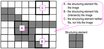
We can infer from the names of these two operations that erosion refers to a process that reduces the sizes of features while dilation refers to a process that increases the sizes of features within an image. This is performed through the use of a structural element and set theory. From [1], erosion of a set of pixels A by a structuring element B results in a reduced version of A wherein the reduction is performed in the shape of B. Dilation of A by B, on the other hand, results in an expanded version of A wherein the expansion is performed in the shape of B.  Reference [2] has a rather nice "hit" and "fit" model to explain the operations of erosion and dilation.
Figure 1. "Hit" and "fit" model to explain erosion and dilation [2]. 
Just for this explanation, let us set the dark portions as having a binary value of 1 while the light portions as having a binary value of 0. As shown in Figure 1, we consider a 2 by 2 structuring element (right) and a test image (left). The erosion and dilation operations involve positioning the structuring element (using its "origin") at each pixel of the test image and testing whether the structuring elements "hits", "fits", or neither "hits" or "fits" the local neighborhood of pixels. The "fit" test is successful if the pixel values of the structuring element all match those of the neighborhood of pixels over which it is overlain. The "hit" test is successful if at least one match is found. If either test is "successful" then, in a new array of the same size, the corresponding pixel position at which the structuring element's origin is currently at is given a value of 1. Otherwise, it is given a value of 0.

These two tests are simply the geometrical explanations used to implement the following set theory defintions of erosion and dilation. We have,
where the first equation is for erosion and the second equation is for dilation. Here, A is the test image and B is the structuring element. The subscript z signifies a translation of B by the vector z (equivalent to "moving" the structuring element to each cell of A). Note that the dilation operation requires that we reflect the structuring element about its origin before applying the "hit" test!

Subsequently, the operation of erosion employs the "fit" test while the operation of dilation employs the "hit" test (with the added reflection!). Before doing any programming, we can actually try to predict the results using some sample test shapes, structuring elements, and the  "hit"/"fit" tests described previously. The results are shown in Figures 2 and 3.

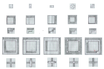
Figure 2. Predicted results of the erosion procedure using a test shape (leftmost column) and a corresponding structuring element (topmost row). The shaded boxes are those that were removed from the original shape as a result of the procedure. The new shape is outlined in solid black.
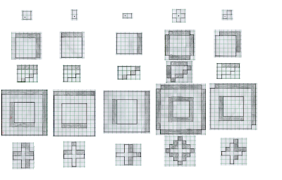
Figure 3. Predicted results of the dilation procedure using a test shape (leftmost column and a corresponding structuring element (topmost row). The shaded boxes are those that were added to the original shape as a result of the procedure. The new shape is outlined is solid black.


As shown, we see that the erosion procedure alters the shape of the features in such a way that their sizes are decreased while the opposite (sizes are increased) occurs for dilation. Before pointing out additional observations, however, we can verify these hand drawn results with those generated from a computer program. The Scilab program implemented makes use of the very useful IPD toolbox developed by Harald Galda [4]. Most of the main functions used in this blog come from this module. Sample code for the dilation of a 5 by 5 square with a 2 by 2 structuring element is shown below in Figure 4.

1
2
3
4
5
square5=zeros(9,9)
square5(3:7,3:7)=1

SE1=CreateStructureElement('custom',[%t %t; %t %t])
Result11=DilateImage(square5,SE1)
Figure 4. Sample code used

Lines 1 and 2 handle the generation of the 5 by 5 square with padding on all sides. This padding is placed just to aid in viewing as the problem of "border pixels" introducing unwanted artifacts is accounted for in the DilateImage() and ErodeImage() functions [3]. Line 4 accounts for the creation of the structure element. Note that the origin of the structure element is set by default. Lastly, the result of the dilation/erosion procedure is performed in line 5.

The results of these programs are now shown in Figures 5 and 6.

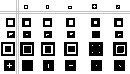
Figure 5. Computer generated results of the same test shapes and structuring elements used in Figure 3 for the erosion procedure.

Figure 6. Computer generated results of the same test shapes and structuring elements used in Figure 3 for the dilation procedure.

First off, we see that shape-wise and size-wise, the results in Figure 2 and 3 are consistent with those in Figures 5 and 6, respectively. If there are any differences, we see that it is in the choice of pixel membership. For example, considering the result in row 1 and column 1 of Figure 2 and 5, we see that in Figure 2, the upper right corner set of pixels are eroded while the upper left corner set of pixels are eroded in the result in Figure 5. This is attributable to a difference in the choice of the origin of the structuring element. Although the choice of the origin of the structuring element may affect the output by changing which pixels are given membership in the final output (and thus the "position" of the final image), the two results are still exactly the same when compared in terms of their morphology (and this is what we're trying to alter anyway!). (EDIT: This, however, did not seem to be true for dilation especially when the structuring elements used are not symmetric). Moreover, because the Scilab functions used have no mention of a specific origin used, slight deviations between drawn and computer generated results exist.

Taking a look at the results, it is rather difficult to come up with some general rule and gain full intuition on predicting the outcomes of both the erosion and dilation procedures. For relatively "simple" structuring elements such as the 2 by 2 square, the column, and the row, we see that erosion/dilation procedures result in the removal/addition of pixels in the "preferred orientations" of the structuring elements. For example, erosion/dilation with the 2 by 2 square results in a reduction/addition of equal amounts of pixels along both the horizontal (let's call this the x-direction) and vertical (and this the y-direction). Correspondingly, erosion/dilation with the column and row structuring elements results in a reduction/addition of equal amounts of pixels along the vertical and horizontal directions, respectively. Additionally, notice how the reduction/addition is performed such that the shape of the test feature is patterned after that of the structuring element's. Although this general reduction/increase of pixels in the "preferred orientations" of the structuring element used is still somewhat observed for the generated results using the plus and diagonal structuring elements, the shapes and sizes of the original features are drastically changed. It is thus obvious that there are additional factors influencing our outputs!

Absent from the above discussion is any mention of the sizes of the structuring elements used. It is important to remember that not only the shapes of the structuring elements matter, but also their sizes relative to the sizes of the features. This point is demonstrated by the blank result in row 5 column 1 of Figure 5. Due to the the structuring element used being of comparable size with respect to the features being analyzed, the original morphological characteristics of the features are vastly changed. This factor is particularly important when we implement the closing, opening, and tophat operators as will be discussed later.

For more complicated shapes and structuring element combinations, it appears to be almost impossible to predict (at a glance) the effects of the erosion and dilation features. This fact is especially applicable for the dilation operation (as it requires a reflection) when using a structuring element that is not symmetric as it requires some "imagination" to predict the result in an instant.

Thus, choice of each of the characteristics of the structuring elements completely depends on the test image used and one's objective.

To fully push the point home for this section, I've made a GIF illustrating the erosion operation acting upon a test image. (Can you do the same for the dilation operator?) Note that the elements that are to be changed are changed only after the fit test is applied to ALL cells.

Figure 7.  "Real-time" implementation of the erosion operation on a test image (left) using a 2 by 2 square structuring element (right). The squares in grey refer to 0 values while the squares in white refer to white values. 


CLOSING, OPENING, AND TOPHAT

Well that's done. As shown previously, both the erosion operators can drastically change the morphology and size of features within a test image. Moreover, notice how erosion and dilation have opposite effects. The word "opposite" is used in the sense that erosion results in a shrinking of features while dilation results in a enlargement of features. This, however, does not mean that we can revert a dilation operation by applying an erosion operation or vice-versa (In most cases, we can't!). This is due to the fact that we must take into account the effect of the size, shape, and symmetry of the structuring element used for both operations. Mathematically, erosion and dilation are termed as dual operators (See [2] for more details).

What this tells us is that an erosion followed by a dilation generally does not yield the same result as a dilation followed by an erosion.It just so happens that this pair of operations lead to the definition of two operations: closing (dilation followed by an erosion), and opening (erosion followed by a dilation). As their names suggests, the closing operator can fill in holes within the image while the opening operator can open up gaps between features connected by thin bridges of pixels. What's more important is the fact that for both operations, the size of the some features within the image before and after application of the operation remain the same! This is of course dependent on the structuring element used in the operation. Fortunately for us, the closing and opening operations can be performed using Harald Galda's built-in functions CloseImage() and OpenImage().

Let us consider the test image in Figure 8a and the resulting outputs of applying the opening operation with varying cubic structuring elements in Figures 8b , 8c, 8d, and 8e. The test image used contains circles of varying sizes connected by "pixel bridges" of increasing thickness from left to right.
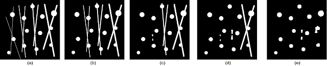
Figure 8. Shown are the (a) test image, and the opening operation results using cubic structuring elements of sizes (b) 3 by 3, (c) 5 by 5, (d) 6 by 6, and (e) 8 by 8. 
 We see that as the size of the structuring element is increased, thicker and thicker pixel bridges are removed from the image. Thus, the choice of what structuring element to use depends on the desired objective. Moreover, notice that even in Figure 8e, there are still remnants of the thicker lines. These remnants do not get removed by the opening operation due to the fact that the intersection of pixel bridges construct regions that are bigger than the structuring elements used. As a general rule, however, we can choose the size of our structuring element to be the same size (or larger if you don't care about other possible elements) as the "pixel bridges" that are to be removed.

Moving on to the closing operation, let us consider the test image of a circle with "spotting" in Figure 9a. We apply the closing operation using varying sizes of structuring elements to obtain the results in Figures 9b to 9d.

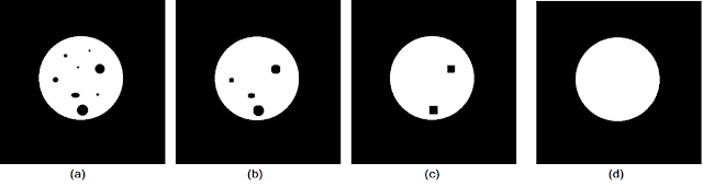
Figure 9. Shown are the (a) test image, and the closing operation results using cubic structuring elements of sizes (b) 8 by 8, (c) 15 by 15, (d) 20 by 20.
As the size of the structuring element increased, more and more of the "spots" are closed up until we end up with a solid circle in Figure 9d. Again, this shows that the size (and shape) of a structuring element must be chosen based on the sizes of the features that are to be removed.

Let's say, on the other hand, that for some reason, we want to obtain those elements that were removed after an opening operation. To do this, we simply take the difference between the opening results and the original image! This leads us to the top hat operators which come in two variants: the white top hat operator and the black top hat operator (The black top hat operator is more interesting when applied to gray scale images and thus will not be discussed in this context.). The white top hat operator is defined as the difference between the original image and the "opened" image [5]. Using the test images in Figure 8 and 9, we can test the effect of these operators. The results are shown in Figure 10.

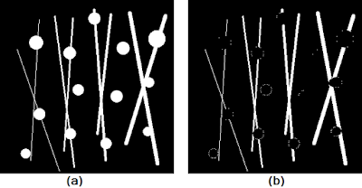
Figure 10. Shown are the (a) test image and (b) result of the white top hat operation using a circular structuring element of radius 8. 
First, notice how instead of using the usual square structuring element as was done previously, I chose to use a circular structuring element instead. Though not immediately obvious, the usage of such a structuring element aims to preserve the circular shape of the circles more. Remember that results of the basic operations of erosion and dilation (from which all the subsequent operations discussed are based) are dependent on both the size AND shape of the structuring element used. Finally, as expected, the white top hat operation yielded the pixel bridges that were "opened" in the original image.

Now that we have more than a working feel of the some simple morphological operations, it's time to apply what we've learned to a "real world" scenario.


THE ODD ONE OUT


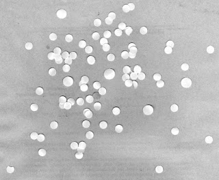
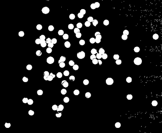
Let's consider the scenario of trying to find the mean size of a human cell from an image in the hopes of using this mean size to analyze other similarly scaled images and reject cells that are abnormally larger. We simulate this setup by using an image of punched out circular pieces of paper as shown in Figure 11.

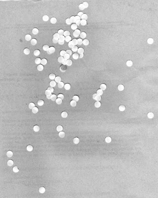
Figure 11. Punched out circular pieces of paper meant to simulate a swatch of human cells

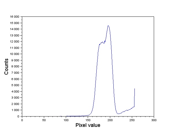
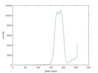
Our goal is to obtain the area of each circular paper (by counting pixels) and use statistics to find the mean value and standard deviation. As such, the first step would be to threshold the image. Let's take a look at the histogram plot (see my previous blog on COLOR SEGMENTATION on how to do this!) of the image in Figure 11.

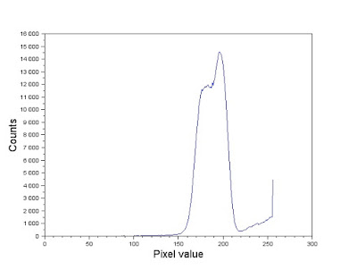
Figure 12. Gray scale histogram of the image in Figure 11.
Comparing the histogram in Figure 12 and the image in Figure 11. Looking at Figure 11, note that the brightest sections in the image (which correspond to values near 255) are those occupied by the cells. Majority of the image, however, is composed of a mix of grayish values. In the histogram, this is represented by the tall dominating feature in the graph. Because the elements of importance are the white circles, we segment the image using a threshold that sets all other components but the white circles to a 0 pixel value. We therefore use a threshold value of 220 and the SegmentByThreshold() function [4] to isolate the white circles. The image was then cut up into twelve 256 by 256 images as shown in Figure 13. Note that because the image dimensions weren't multiples of 256, the cut out images overlap each other. This isn't so much of a problem. In fact, ensuring an overlap between the photos might even help emphasize the "true" mean size of the cells.

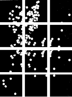
Figure 13.  Binarized form of Figure 12 cut up into twelve 256 by 256 images. Note that an overlap between cut out images was ensured.

Why is it necessary to cut up the image into twelve? Although the histogram in Figure 12 validated the use of a single threshold value for the entire image, the subsequent processes (like the morphological operations!) may be more effective if used at a more local level. From here, if we can find some way to locate and identify each individual "cell" and count their number of pixels (the "effective" area) we can average out the results to obtain a mean value. This is easily done using the SearchBlobs function wherein a "blob" is any group of connected white pixels. The output of this function is a matrix of the same dimensions as the original image but with the pixels of each continuous "blob" detected replaced by a single unique number. In other words, Searchblobs comes up with a way to index our image based on the presence of isolated pixel groups. So what's stopping us? Let's go ahead and take the 7th image in Figure 13 and do this(Row 3, Column 1)! The code used to do this is shown in Figure 14.

1
2
3
4
5
6
pic=imread('C:\Users\Harold Co\Desktop\Applied Physics 186\Activity 8\Attachments_2016117 (1)\circles\7.png')
binarized=SegmentByThreshold(pic,220)
marker_image=SearchBlobs(binarized)

numberblobs=double(max(marker_image))
ShowImage(marker_image,'Result',jetcolormap(numberblobs))
Figure 14. Code used to search for "blobs" in a binarized image. 
Note that numberblobs is the number of blobs detected in the subimage chosen. The jetcolormap() function was used to color code the various detected blobs in the subimage. The results are shown in Figure 15. 


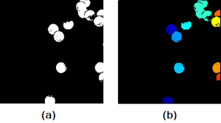
Figure 15. Shown are the (a) subimage, and (b) result after the SearchBlobs() procedure.
At first glance, it seems as if the SearchBlobs() function was a success. Upon further inspection, however, notice that there are small artifacts surrounding the blobs that are of different color (look REALLY closely). What this means is that these small artifacts, although we know them to be part of the nearby blob, are being tagged as entirely different blobs. If the resolution of the photo stops this from convincing you, note that the value of the numberblobs variable is 20, despite the fact that the we can only identify 13 blobs in Figure 15a. The presence of these artifacts is due to the fact that the cells in the original image (before binarization) contained pixel values that were the same as those that were removed in the thresholding process. Moreover, single pixels too small to see (those present in the "background" of the image and were not removed during the thresholding process) Thus, it is obvious that we need to find some way to reconstruct what was lost during the thresholding process before we apply the SearchBlobs() function. This is where our morphological operations come into play! Let's use the same subimage as a test example. 

(At this point, Scilab has failed my once again and started malfunctioning on my PC again. Switched to MATLAB instead! The complete code for the processing of one of the subimages within MATLAB will be shown.)

First notice that there are "holes" in the several of the blobs that need to be closed up. This is to ensure that we get a more accurate value for our area calculation later. It makes sense therefore to apply the closing operator with a circular structuring element (because the blobs are roughly circular) of a size slightly bigger than the gaps we want to fill. Thus, we use a circular structuring element with a radius of 5. Additionally, to remove any small isolated artifacts left out by the thresholding procedure and the cutting of the subimage, an opening operation is performed using a circular structuring element of radius 1. The results are shown in Figure 16. 


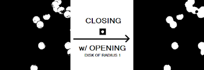
Figure 16. Before and after of the closing procedure with a circular structuring element of radius 5 and opening procedure with a circular structuring element of radius 1. 


The MATLAB code to implement this is shown below in Figure 17.

1
2
3
4
5
6
7
original=imread('7_binarized.png');
imshow(original);

se1=strel('disk',5);
se2=strel('disk',1);
closed_image=imclose(original,se1);
closed_image=imopen(closed_image,se2);
imshow(closed_image)
imwrite(closed_image,'7_binarized_closed.png');
Figure 17. MATLAB code used to apply morphological closing to an image

Although the gaps in the image were effectively closed, another problem has popped up. Because there are overlapping objects in the original image, the closing procedure effectively combined close enough blobs into consolidated blobs. Thus, if the counting procedure is employed, it would be as if there existed larger than normal cells and fewer cells than there actually are.  Thus, we must find some way to reopen the gap between these cells.

A possible answer lies in the watershed algorithm. This algorithm requires that we think of the gray scale intensity image as a topographical map with positive pixel values representing elevation and negative values representing depth. These "low regions" are termed "catchment basins" and are separated form other "catchment basins" by a watershed line. Without going into too much detail, the algorithm is able to separate overlapping catchment basins given their "seed points" (pixel position of the deepest point). For more explanation, you might want to check reference [6]. Anyway, the implementation performed in shown in Figure 18.


1
2
3
4
5
D=-bwdist(~closed_image);
I3=imhmin(D,0.189);
L=watershed(I3);
closed_image(L==0)=0;
imshow(closed_image);
Figure 18. MATLAB code used to separate connected blobs


The MATLAB watershed() function requires that it is passed an image wherein each object of interest is represented by a unique catchment basin. We can turn the objects in a binary image into catchment basins by using the distance transform. For each pixel in an image, the distance transform assigns a number that is equal to the distance of that pixel to the nearest non-zero valued pixel. In MATLAB, this function is bwdist(). If we go ahead and use bwdist() on closed_image, we still wouldn't have separate catchment basins for each individual object because the distance transform of the overlapping white region will yield a constant black region (think about it!). Instead, we take the distance transform of it's compliment and then take the negative of this (because our "catchment basins" are the white regions). Passing this to the watershed() function yields a label matrix L containing the separated catchment basins areas each labeled with a unique index. We can use where the label matrix equals zero (no catchment basin) to thus segment the original image. Note that the imhmin() is used to suppress minima in the intensity image less than a certain threshold. This is to prevent oversegmentation and to provide more control over the watershed procedure. For the closed image in Figure 16, we obtain the watershed segmented image in Figure 19.


Figure 19. Before and after of the watershed procedure using an imhmin() threshold of 0.189.
As shown in Figure 19, the watershed procedure was successful in separating all of the overlapping except for one instance (see the upper right pair of blobs). This failure of the algorithm is most likely due to the fact that the coupled blob straddles the border of the image and thus the distance transform of this region does not yield to a large enough gradient to be considered a sink.

Now that's all done, it's finally time to count blobs! We use the MATLAB function bwlabel() to label each connected region of pixels with a unique label. For each label (and thus each "cell"), we can find the area. We can then find the mean and standard deviation of the areas of the cells present within the subimage chosen. This is implemented in the MATLAB code in Figure 20 using the closed_image output from the code in Figure 18.


1
2
3
4
5
6
7
conn=bwlabel(closed_image);
blobarea_list=zeros(1,max(conn(:)));

for i=1:max(conn(:))
    blobarea=size(find(conn==i),1);
    blobarea_list(1,i)=blobarea;
end

Figure 20. Measurement of the area of each detected "cell" in the subimage.

Now, that we've developed a suitable method, all we have to do is apply the same algorithm to all the other subimages! Note, however, that that we have three parameters that we can vary: the size of the structuring element for the opening and closing operation, and the threshold for the watershed algorithm. Shown in Figure 21 are the results of applying the outlined procedure to each subimage and the parameters used for each subimage. As expected, the parameters used greatly varies from subimage to subimage.

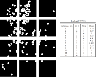
Figure 21. Results after applying the outlined procedure to each subimage in Figure 13. The parameters used (size of structuring elements for the closing/opening operations and the threshold for the watershed algorithm) are also shown.


We can portray all of the areas measured using a histogram as shown in Figure 22. 
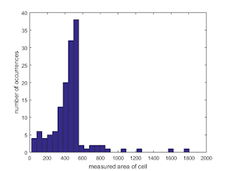
Figure 22. Shown is a histogram of the measured cell areas
From the histogram, we see that the measured areas generally fall within the 400 to 600 range. The values outside of this range are attributed to failures of the watershed algorithm to separate large overlapping cells (800 and greater measured areas) and cells that lie along the sides of the subimages and were "cut" during the taking of the subimage. Thus, we exclude these occurences and calculate the mean and standard deviation of those that fall within the 400-600 range only. Thus, we obtain a mean of 489.2824 and a standard deviation of 41.8058. Thus, using one standard deviation as the basis, we would expect "normal cells" to have a size between 447.4765 and 531.0882.

Now that we FINALLY have a "standard" cell size to use, let's try using this value to find abnormally large "cells" in another test image. Consider the test image shown in Figure 23.

Figure 23. Test image containing a mix of "cells" of different sizes.
At first glance, we see that there are some abnormally large cells. Let's see if we can use our calculated mean value and standard deviation to automate the finding of these cells. Again, to work with this, we need to first threshold the image. To do this, let's take a look at its histogram.

Figure 24. Histogram of the test image in Figure 23
From the histogram, it seems as if we can use the threshold value of 213. The thresholded image is shown in Figure 25.

Figure 25. Output of applying thresholding on the test image in Figure 23 using a threshold of 213.
From here, we could spend a TON of time cleaning up the image with the bag of tricks used earlier. Those who would take that path either find joy in the tediousness or have simply lost sight of our goal. Remember that all we need to do is to identify the possible cancer cells. Because cancer cells are bigger than normal cells, we can say that any cell with an area greater than our mean value plus one standard deviation is with all likelihood, a cancer cell. Thus, using the calculated values earlier, the maximum size of a "normal" cell is 531.0882. How do we go about finding the cells with areas greater than this value? An immediate "solution" might be to progressively filter by the cells by size by analyzing the area of each cell and rejecting it if it did not fall within the normal range. Not only is this method ungainly, but it also isn't as simple to implement. A MUCH easier method would be to take advantage of the ever powerful opening operator! Remember that the general rule for the opening operator is that it can remove features that are smaller than the size of the structuring element used. Thus, if we have knowledge of the maximum size allowable for a cell to be deemed "normal" then performing an opening operation using a circular structuring element of this size will leave all features (and thus, the cancer cells!) greater than this threshold. Thus, using the maximum size of 531.0882 and the formula for the area of a circle, the maximum radius allowable (and thus the radius of the circular structuring element to be used) is sqrt(531.0882/π) ≈ 13.0019. So all that's left is to do it! Check out Figure 26. 


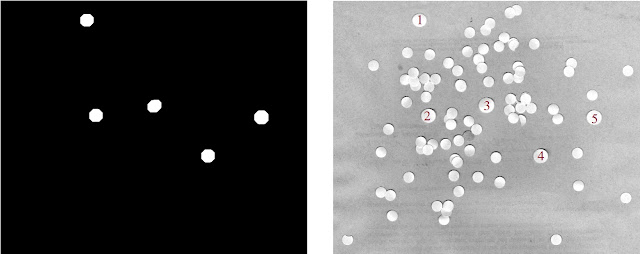
Figure 26. Shown are the filtered out "cancer" cells (left) and the identification of these cells in the original test image (right)
Visually scanning the test image shows us that the cells identified are much larger than the other cells and thus are the likely cancer cell candidates! It is worthy to note that the quick opening operation as able to complete the task even if there were overlapping cell regions. It probably wouldn't have worked as well, however, if there was significant overlapping of cells. We've fought cancer!

FINALLY I'm done. Crazy long blog post (26 figuressss) which took me more than a week to finish! I do admit that I initially was not as excited to delve into this topic as compared to the other topics, but after powering through, I realized how many minute points of analysis I could bring up. Studying the erosion and dilation outputs really helped me get an strong intuitive feel of these morphological operations to the point that I was able to apply them (without too much trial and error) to a "real world" scenario. A big plus was also learning the useful watershed algorithm along with the distance transform! Because of all of this, I'd give myself a 12/10.

Acknowledgements:

I'd like to acknowledge Bart's blog for giving me the idea to display the erosion and dilation outputs in a grid format for better understanding. I'd also like to credit Carlo Solibet's blog on giving me the idea to use the opening operator to filter out "normal" sized cells. This greatly sped up the process.

References:
[1] 1. M. Soriano, “Morphological Operations,” 2014.
[2] (n.d.). Morphological Image Processing. Retrieved November 07, 2016, from https://www.cs.auckland.ac.nz/courses/compsci773s1c/lectures/ImageProcessing-html/topic4.htm
[3] Documentation. (n.d.). Retrieved November 07, 2016, from https://www.mathworks.com/help/images/morphological-dilation-and-erosion.html
[4] Scilab Module : Image Processing Design Toolbox. (n.d.). Retrieved November 08, 2016, from https://atoms.scilab.org/toolboxes/IPD/8.3.1
[5] GpuArray. (n.d.). Retrieved November 22, 2016, from https://www.mathworks.com/help/images/ref/imtophat.html
[6] The Watershed Transform: Strategies for Image Segmentation. (n.d.). Retrieved December 04, 2016, from https://www.mathworks.com/company/newsletters/articles/the-watershed-transform-strategies-for-image-segmentation.html