Moreover, it can't be forgotten that the FT values have both
real and
imaginary components that
BOTH contribute to the image spectrum. Just to further point this out, take a look at Figure 3.
 |
| Figure 3. FT output of the image in Figure 1b1. Shown are the (a) magnitude, (b) real, and (c) imaginary parts of the output. |
We see that although both the real and imaginary parts of the FT output share similarities to the magnitude output, we can't choose one over the other. This will be further explained in the next example.
To further our understanding, let's take a look at the FT of another image. In particular, we consider an image that is symmetric about the y-axis but not symmetric about the x-axis. The results are shown below.
 |
| Figure 4. Shown are the (a) original 'A' image, (b) fourier transform, and (c) fourier transform of Figure 4b. |
First up, we see the existence of a bright white spot at the center of the spatial frequency spectrum in Figure 4b. This corresponds to the DC component of the image (0 frequency). In general, as was observed in the circle cases previously, a DC term (and thus a bright white center spot) always exists as it corresponds to the average brightness of the image.
Next up, we see diagonal lines that seem to be fairly perpendicular to the "legs" of the A. Thinking about this in light of the "spatial frequency" interpretation of the fourier transform, this makes sense!
We can gain some intuition by considering line scans ("paths") starting from the center of the images diagonally outwards. These line scans can be interpreted as 1D signals whose values correspond to brightness pixel values. Note that the paths along which the pixel values change the fastest are those paths that intersect the edges of the "A" perpendicularly. Consider the two paths indicated in red in Figure 5.
 |
| Figure 5. Line scan "paths" within the image 'A' |
Comparing paths 1 and 2, we note that the pixel brightness values changes faster along path 1 than along path 2. This is because the length of path 2 within the white area of the A is longer than that of the length of path 1 (shortest distance between two parallel lines is the perpendicular). Correspondingly, a faster change in pixel values results in higher frequencies being present along that specific direction. Thus, within the spatial frequency image, we expect a spread of higher frequencies along the direction of path 1 compared to path 2. This results in the diagonal lines in Figure 4b mentioned previously. The same interpretation can be used to explain the existence of the artifacts along the vertical within Figure 4b, albeit it being slightly more involved.
Now after applying the FFT to Figure 4b gives us Figure 4c. The math of the FT tells us that applying the FT twice to an image brings it from the spatial domain, then to the frequency domain, and then back to the spatial domain. Figure 4c gives us exactly that except for the fact that the image appears to be inverted. Interestingly, the same results are obtained for that of the physical thin lens, given that the object image is placed at the focal length of the thin lens. Thus, the physical equivalent of the double application of the FT to an "object image" is that of a thin lens!
Another explanation, although significantly more "hand-wavy", can be formulated by going back to the interpretation of the fourier transform of an image as the Fraunhofer diffraction pattern. We can consider the diagonal legs of the "A" as diagonally oriented rectangular slits. Correspondingly, experimental results (single and double slit experiments) tell us that the resulting diffraction patterns are diagonally oriented version of the typical result. More on this later.
Going back to considering the
real and
imaginary parts of the FT, let's consider the real and imaginary parts of the fourier transform of the "A" image.
 |
| Figure 6. Shown are the (a1) real and (b1) imaginary parts of the fourier transform of the image 'A' along with the FT of each of these parts in (a2) and (b2), respectively. |
Figures 6a1 and 6b1 show us that the fourier transform of an image has both real and imaginary components. Mathematically, these are interpreted as the amplitude and phase of the frequency spectrum. Reconstructions(by applying the FT transform again to go back to the spatial domain), however, are vastly different from what was obtained in Figure 4c. Thus, this tells us that information contained in the original image is contained in
BOTH the real and the imaginary parts. Prioritization of one over the other will result in some information being lost.
Now that we have a somewhat better understanding on the FT of images, let's move on to a variety of examples! Shown in Figure 7 are several test images (first row) and their fourier transforms (second row).
 |
| Figure 7. Shown are several test images (first row) and their corresponding fourier transforms (second row). |
We see that the test image of the sinusoid in Figure 7a1 yields three identifiable white points positined along the horizontal after the FT is applied. The two points on either side of the center indicate the frequency of the sinusoid used to generate the original test image. The middle point (DC value) exists due to the fact that a constant bias had to be added to image in order to prevent the clipping of the negative values of the sinusoid due to the use of the imshow() function. Ideally, if we did not have to consider this, we would expect no DC term as the average brightness of the photo would be 0.
Now considering Figures 7b1 and 7b2, we see that these resemble the aperture (Figure 7b1), and diffraction pattern (Figure 7b2) obtained in the double slit experiment. Moreover, after observing the results in Figures 7a1, 7a2, 7b1, and 7b2, we see that the FT transforms widely spread out patterns to narrowly spread out patterns and vice versa. Physically constricting the aperture along both the x and y dimensions (Figure 7c1) leads to diffraction along both directions as well (Figure 7c2). Lastly, we see that the fourier transform of a relatively more spread out 2-D gaussian (Figure 7d1) results in narrower 2-D gaussian (Figure 7d2). This tells us that the signal corresponding to a gradual
gaussian change in pixel values is made up of sinudoids following a
gaussian frequency profile as well. Very interesting.
CONVOLUTION
For all the above, the physical phenomena considered is that of the diffraction of a plane wave as it passes through apertures of various sizes (applying the FFT once) and the image of an object given a thin converging lens of infinite diameter (applying the FFT twice). In reality, however, real lenses are of finite diameter and thus, diffraction effects must be considered. To consider both the magnifying property of the lens as well as its finite dimensions, we make use of the
convolution theorem. In the shortest way possible, the
convolution theorem gives us a powerful way to solve complex diffraction problems. Physically, we can simulate the image output given an object image and a finite lens by convolving the object image with the aperture function. The aperture function accounts for the finite dimensions of the lens while the FT accounts for the lens itself. Fortunately for us, the process of applying the convolution theorem is greatly simplified using the FT. Specifically, the convolution of two functions is equal to the product of the FT of each individual function.
As a demonstration, consider the test image containing the word "VIP" below.
 |
| Figure 8. |
We then convolve (by multiplying the fourier transform of each image) this with an image containing centered circles of various radii. These account for the finite diameter of real world lenses. The results are shown in the first row in Figure 9 along with the diameter of the aperture used.
 |
| Figure 9. |
First off, we see that the double application of the FT inverted the image vertically as is done by a converging lens. More interesting is the fact that for small aperture sizes, the output image appears blurred due to the significant effects of diffraction. As the aperture is increased in size, the diffraction effect decreases until eventually, an optimum size is reached after which any increase in aperture size (or physically, the lens diameter) results in no observable improvement in the clarity and sharpness of the output image. This trend is consistent with the results obtained previously for the 'A' image in Figure 4. We can think of the demonstration in Figure 4 as the result of a convolution between the 'A' image with a completely white image (infinite lens diameter).Without even having to do the math (because the fourtier transform of a completely white image would result in a single bright dot in the center of it's frequency spectrum), we would expect the output "A" image to be an inverted (but in no way distorted) version of the input "A" image.
CORRELATION
A mathematically related but different operation is the correlation between two functions. As its name suggests, the correlation between two images produces a third image that contains information on the regions wherein there are similarities between both images. For this reason, this operation can be used in pattern recognition. Like convolution, the correlation operation is made easier through the use of the fourier transform! Within fourier space, the correlation between two images is simply element to element multiplication (as in convolution) with the exception that the fourier values of one of the images is "conjugated" before the operation begins. Conjugating a value simply corresponds to changing the sign of it's imaginary part.
To explore this, we try to find the occurrences of the letter "A" within an image. By conjugating the image function in Figure 10a and multiplying it element-wise with the pattern image in Figure 11a1, we obtain the image in Figure 10b.
 |
| Figure 10. Shown are the (a) original image, (b) output of the correlation algorithm with the letter 'A', and (c) superimposed image of (a) and (b). The bright white dots in (b) are made red in (c) to make aid in visualization. |
Indeed, the correlation between the two images produces a third image with information on the regions wherein the original image and the "A" image are similar! These similarities appear to manifest as bright white dots indicating the positions where the "A" patterns are found. To further verify this, we superimpose Figures 10a and 10b to produce 10c (Note that the bright white dots in figure 10b were made red to make analyzing Figure 10c easier) and see that the bright white dots do indeed correspond with the occurrences of the 'A' within the text image.
There are, however, two slight niceties are absent from the discussion above. First, absent from the definition of correlation (well, within the framework of applying the operation to pattern recognition) is the distinction between the test image and the pattern image. Unlike in the convolution case, this distinction is important due to the fact that switching the conjugation operation may produce a flipped version of the correlated image. For example, by conjugating the pattern image instead of the test image, we obtain the flipped version shown in Figure 11b2.
 |
| Figure 11. Shown are the pattern images used (first row) and the resulting images after being correlated with the test image. Note that for (a1) and (c1), the test image was conjugated while for (b1), the pattern image was conjugated. |
Thus, motivated by the result obtained in Figure 10c, we further define the correlation operation (in the framework of applying it to pattern recognition) as the element-wise multiplication between the conjugated test image and the pattern image. The second point that I'd like to point out is the importance of centering the pattern image to be used. We can somewhat think of the correlation function as a "matching" of the spectral fingerprint of the pattern to be found with its occurrences within the test image. Thus, because the fourier transform remaps images from the spatial domain to the spatial frequency domain in a point-wise fashion, shifts in the pattern image (from the center) may lead to unexpected results after the correlation procedure is performed. This is observed in Figures 11c1 and 11c2. Note that the shift in the "A" from the center produced a shifted version of the test image. Clearly, without having to overlay the two images, the bright white points in the correlated image do not correspond to the positions of the "A" in the original image. This stems from the fact that the underlying spectral fingerprint of the shifted "A" image is different from that of the fairly centered "A" image.
The correlation operation can also be extended to finding entire words within the test image. This was done as is shown by the result in Figure 12.
 |
| Figure 12. Shown are the (a) test image, (b) pattern to be found, and (c) the correlated output. |
Besides the topmost bright white dot in Figure 12c, we see the occurrence of other less bright dots (one for each row of text) as well. This is due to the fact that although the entire word "RAIN" is present only once in the test image, the slight similarities between the word "RAIN" and "AIN" are also highlighted by the correlation operation. Thus, the correlation operation can also be used to measure the degree to which a pattern similarity is found.
To explore another aspect of the correlation operation, we consider the using the test image shown in Figure 13.
 |
| Figure 13. Test image containing various geometrical shapes. |
The patterns we attempt to locate within Figure 13 are shown in the first row of Figure 14 while the outputs of the correlation procedure are shown in the second row.
 |
| Figure 14. Patterns (first row) and the outputs (second row) after being correlated with the test image in Figure 13. |
Looking at Figures 14a2 and 14b2, we note that the correlation procedure successfully located the desired patterns. For the circle in Figure 14a1, the correlated image in Figure 14a2 has 5 bright circular regions corresponding to the positions of the matched patterns in the original image. For the triangle in Figure 14b1, we see that the brightest point in the correlated image corresponds to the position of the "upright" triangle (topmost triangle in the test image). The correlation procedure is thus able to distinguish between rotated versions of the pattern to be found. Lastly, the output in Figure 14c2 using the pattern in Figure 14c1 is interesting as all the figures in Figure c2 appear to be equally bright. Moreover, it Figure 14c2 appears to be a diffracted version of the test image in Figure 13! This is no coincidence given the fact that correlation and convolution operations are very similar. Particularly, when one of the functions used within either process is even, the convolution and correlation operations produce the same results. Thus, we obtain the familiar "diffraction look" obtained in the previous part of this blog. Within the correlation framework, however, we note that although all of the figures in the output image seem to have equally bright regions, fairly localized white points exist only at the centers of the smaller white circles.
EDGE DETECTION
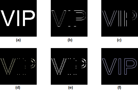
Taking the pattern matching application of correlation a bit further, we can apply the operation to detect "edges" within an image. We consider the VIP image used previously and attempt to find edge patterns within this image. The results are shown in Figure 15.
 |
| Figure 15. Shown are the (a) original image and the correlation results using a (b) horizontal pattern, (c) vertical pattern, (d) right diagonal pattern, (e) corner pattern, and (f) spot pattern. |
The pattern images used were 3 by 3 matrices padded with 0's to the size of the VIP image. The matrices used are shown in Figure 16.
 |
| Figure 16. Matrices used to generate the pattern images |
As shown by Figures 15a and 15b, the brightest regions of the output images correspond to the directions along which the 2's exist. Thus, for both these cases, the diagonals and the curves of the V and P respectively are not emphasized. They are slightly emphasized, however, due to the fact that the curves and diagonals are approximated by short vertical and horizontal sequences of white pixels on the image grid. Looking at Figure 15d, we see that the vertical and horizontal directions edges of the image are not emphasized at all. The brightest region corresponds to the upper right portion of the "P". The left leg of the "V", however, is not emphasized due to it being at a different angle from which the diagonal in the pattern generated using Figure 16c is at. The "corner" pattern generated from the matrix in Figure 16d emphasizes the corner points of each letter in the image. Again, because diagonals and curves can only be approximated by a series of vertical and horizontal pixel values, "corner points" actually exist along the whole length of these features. Thus, the emphasis placed on the diagonals in the "V" and the curves in the "P" are to be expected. Last, but not the least, the spot pattern generated from the matrix in Figure 16e gives us the ideal (what really is the ideal? lol) edge detection output. The important takeaway from from trying out these different edge detection matrices is that we can somewhat obtain a rough estimate of the type of edge detection implemented just by looking at the relative magnitude of the values in the matrices used. Moreover, it must be pointed out that the matrices used are "normalized" (sum of all of the elements must equal to 0) to ensure that multiplication of the images generated form these matrices with the test image does not alter the original image itself.
CODE:
 |
| Figure 17. Code used to display the FT of the A image. This is also used to obtain the real and imaginary parts of the FT. |
 |
| Figure 18. Sample code for the FFT of a sinusoid. The code to display the FFT of the other samples is exactly the same except for, of course, the image generation part. |
 |
| Figure 19. Code used for the convolution procedure. |
 |
| Figure 20. Code used for the correlation procedure. |
 |
| Figure 21. Code used to implement edge detection with the VIP image. |
I must say that was an EXTREMELY long post. Nevertheless, I feel that I now have a MUCH better understanding on the uses of the fourier transform in image processing. The terms "convolution" and "correlation" don't see to scare me as much as they used to anymore. Moreover, I now feel I can delve into more complicated filtering applications using the FT. Besides the specific 2D applications explored in this study, however, I've found that playing around with the fourier transform of 2D functions has let me gain a much better intuition behind the underlying processes involved in the one dimensional case. For all of these reasons, I'd rate myself a 12/10 for my performance during this activity.
Acknowledgements:
I'd like to acknowledge Carlo Solibet for pointing out to me that the fourier transform of a specific image contain artifacts that appear to be perpendicular to edges within the test image. This had led me to find a more intuitive explanation behind the results obtained. I'd also like to acknowledge Ma'am Soriano for given me suggestions on additional points that I might want to explore which include the shifting of pattern images used and the equivalence of the correlation and convolution procedures.